
Client: In Harmony With Nature
Goal: Redesign website
Role: Layout, stylist
Used: Illustrator, HTML, CSS
In a mock redesign project, my group was tasked with updating the website of nonprofit In Harmony With Nature. The original had a lot of broken links to images, JPGs where text should be, and a rather outdated look overall.
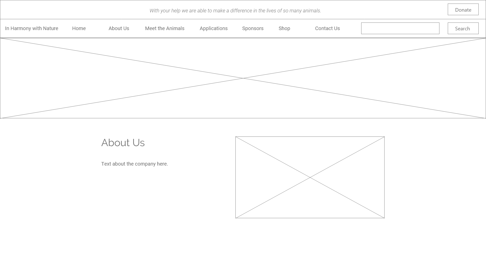
The first task was to reduce the clutter. There seemed to be too many links, many of which could be combined into fewer pages. My team and I worked together to reorganize the information provided so users will find everything more efficiently. The pages were altered or removed so we'd deal with fewer pages. After that, I drew out the wireframes on how we’ll present this wonderful cause. In the meantime, I had to come up with a new style guide to reflect the name and goal of the company. Greens and browns reflected the nature of the business. We added a dash of orange to use on buttons to catch users' attention and complement the earthy colors.


Fonts were next in our selection. We all decided to keep it clean and modern. I had selected Raleway as body text, but was encouraged to use it for headings instead. Roboto was easier on the eyes for longer text anyway. The logo my groupmate created captured the essence of In Harmony With Nature and helped us find our final style.


 Next: Taste of Gainesville
