Client: Hopps Collective
Goal: Create a mobile website concept for a brewing company
Role: Graphic designer
Used: Illustrator, Photoshop, Acrobat
Hopps Collective was a concept brewing company that would drinks and allow local brewers to come in and make their drinks. I was assigned to them to use their logos, images, and color palette to develop a concept for a mobile version of their website. It was a real test of trial and error. It's one thing to make a new branding look for a company. It's very different when they want you to use what they have.
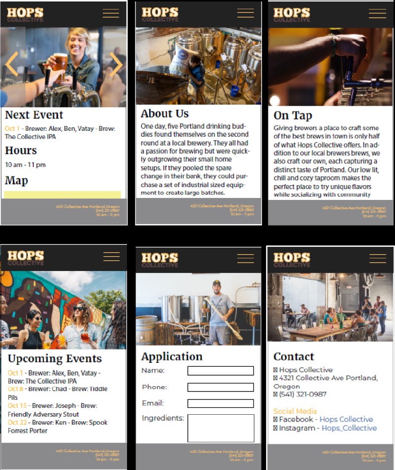
I started planning out the basics of each page they needed. The layout was right, but some sizing and colors were off. The gray footer wasn't flattering and the black navigation was losing some of the logo. I was told to make it warmer, more welcoming.

With their advice in mind, I expanded on the pages and changed up the colors. The navigation and footer were changed to a brown color, which better complemented the text with it. Some images just needed a cleaner layout; less blocky and random. They also requested a background.

I used a gradient to make the background look like beer is being filled into it. It's great in concept, but I see now that some of the gold text is getting lost. If I were to do this again, I'd change the gold text to either brown or blue. I still want those parts to stand out somehow. Yellow just isn't great for text most of the time. Despite what I would have thought, it's not easy working with someone's given logos and color palette. I still think the layout overall is successful and would be easy enough to code.

